Our logo reflects a steady, grounded and a modern take on a brand that has not only existed for over a century with a rich history, but has thrived and become stronger overtime.
The Vossloh Rolling Stock logo is represented by two parts: A clear and concise word mark and the figurative mark. The word mark is set in a modern, yet timeless font and harmonizes well with the figurative mark. It represents the stability of Vossloh Rolling Stock.
The logo and word mark are always displayed in the same colour together. And the sign and word mark always have the same distance to each other—equal to the capital V (See section “Safe Space” below). The logo can be set in Vossloh Rolling Stock Future Yellow or in Vossloh Rolling Stock Pine.
Figurative Mark
The figurative mark represents the flexibility and versatility experienced with a Vossloh Rolling Stock locomotive or service. It embodies a consistent and smooth transition.
The V emphasizes a uniting force that is moving forward with confidence. It is also a reference to the sustainable adaptability of train tracks.
The name “Vision” reflects our aspiration to shape the future of rail transport with clarity and purpose. It stands for forward-thinking innovation and underlines our commitment to sustainable, future-ready solutions.
Main Color Combinations
The logo is primarily Pine, but can also be displayed in Future Yellow on Tech Grey or Pine. If the logo is used in or on applications that don’t allow color use, the logo is used White on Black, and Black on White. The two primary logos are the logo in Pine and in Future Yellow.
For office and non offset applications, the logo in Pine should be used.
For digital and offset applications, the logo in Future Yellow should be placed on Pine background, always using the neon like Future Yellow Pantone tone to stand out.
Color Use
Logo on Images
The logo in Pine can be placed on white and brighter backgrounds like 20% Tech Grey as well as on images.
The logo in Future Yellow can be placed on Pine, Tech Grey and on darker backgrounds as well as on images.
Applications in Black and White
Applications on Safety Clothing
Minimum Size
The minimum acceptable size is 6 mm of the entire logo unit in height. If the logo needs to be printed smaller: The sign plus the URL is used.
For embossment, minimum height of the logo unit should be 10 mm.
Safe Space
The safe space is constructed using the cap height of the V of the Vossloh Rolling Stock word mark.
In general, the identity of Vossloh Rolling Stock is characterized by the generous use of white space. Therefore more space is encouraged.
Logo Placement Rules
The logo can be placed in two ways:
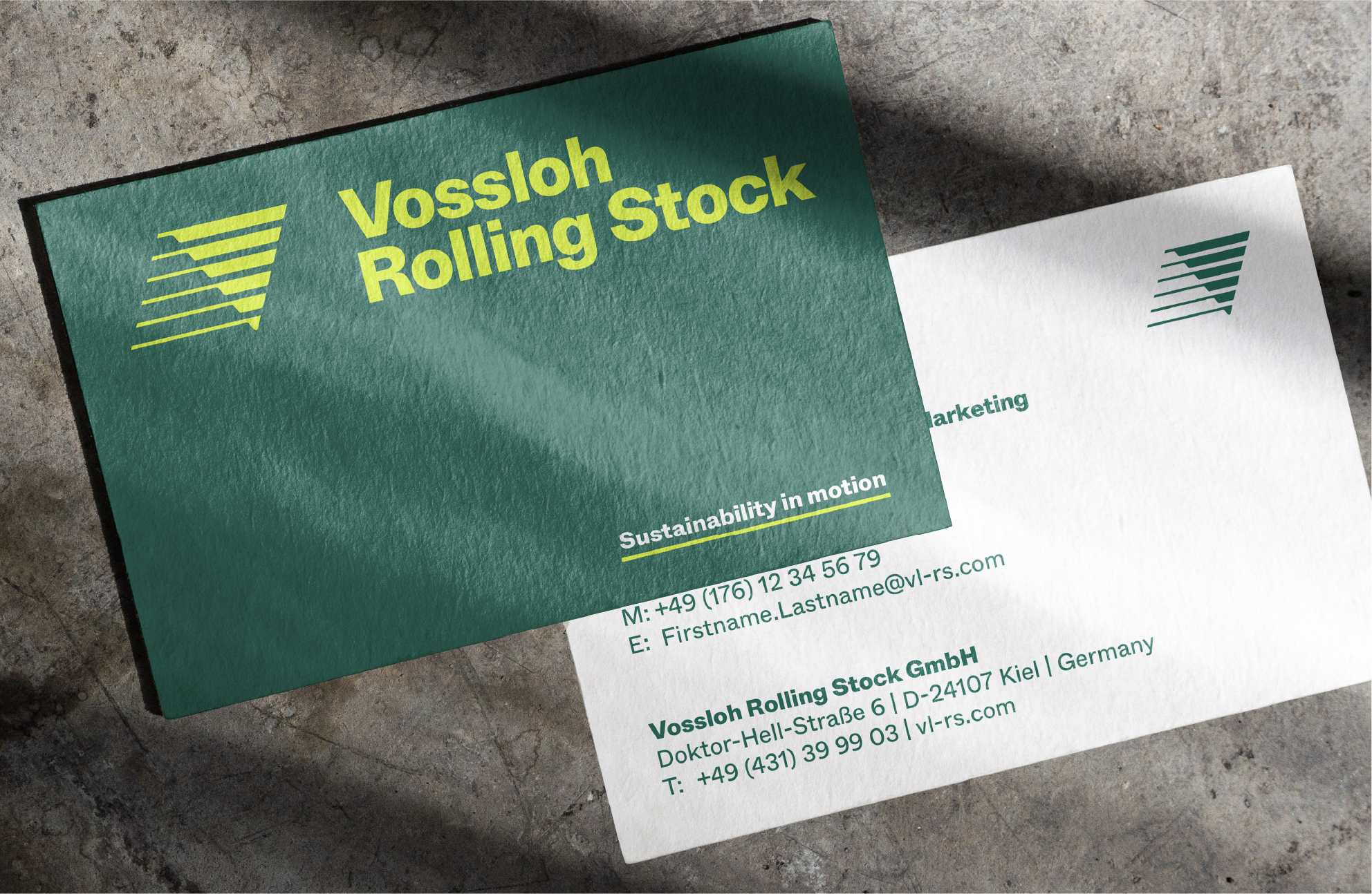
Top right corner (e.g. letterhead, print ad or brochure cover) or, more rarely, top center (business card), minding the safe space.
The logo will never be placed at the bottom of a layout or on the left side.
The only exception is the website for UX reasons, the logo is placed on the top left corner.
Logo Misuse
The logo can never be set in Tech Grey.
The logo should never be stretched.
The logo should never be placed upside down.
The logo should never be set in a tint of Future Yellow.
The logo should never be compressed.
The figurative mark should never be flipped.
The logo should never be set in lower opacity / tints of pine.
The logo should never be tilted.
The figurative mark can never be placed on top of the wordmark.
Never add a drop shadow to the logo.
The lines can never be expanded within the logo.
The logo in Pine can never be placed on dark background.
The logo should bever be displayed with outlines.
The figurative mark can never be moved away from the wordmark.
The proportions within the logo should never be changed.