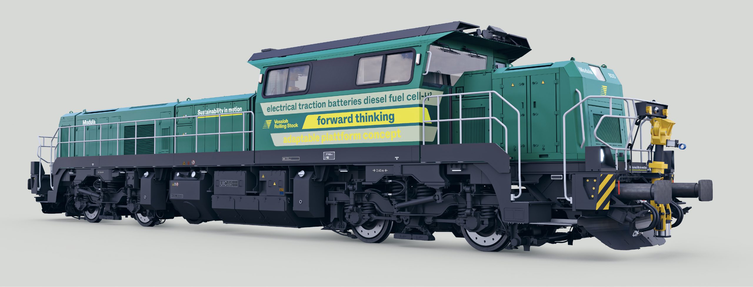
To convey the Vossloh Rolling Stock’s brand values as reliable yet adaptable and to maintain a consistent brand appearance across all media and channels, we developed a customized corporate font: VosslohRollingStock Whyte.

The typeface is characterized by having smooth and sharp transitions, its design has a strong horizontal approach. The typeface is a costumized version of ABC Whyte, created by the type foundry Dinamo.
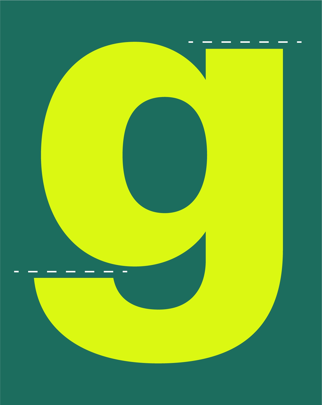
What is Customized?
We customized the letters g, Cc and Ss to put even more emphasis on the linear and horizontal appearance of the brand.
Based on the logo design, the typeface is emphasizing the horizontal, stable and confident design from the logo, whether if it is used in the regular, bold or heavy font cut. The fonts are available as otf, ttf, woff, and woff2.
Typographic Hierarchy
All text is set to left align, and never justified with no exception. Body text and subline uses indent on all sections except the first. More text about the hierarchy.
VosslohRollingStock Whyte Heavy
Is always set in Vossloh Rolling Stock Pine and used for headlines only. Really big headlines or text can be set with a tracking down to -30. Headlines should not be tracked too loose, so it loses it’s boldness and compactness. If the headline becomes bigger than 42pt, then tracking is added.
If the background is sufficiently dark, Vossloh Rolling Stock Future Yellow can be used, for all type treatments and type sizes.
VosslohRollingStock Whyte Bold
Is used for bolding/emphasising important text.
VosslohRollingStock Whyte Regular
Is used for part of headlines, quotes, body copy and detail text. Bodycopy and detail text is always set in black. Headlines and quotes are set in Vossloh Rolling Stock Pine.
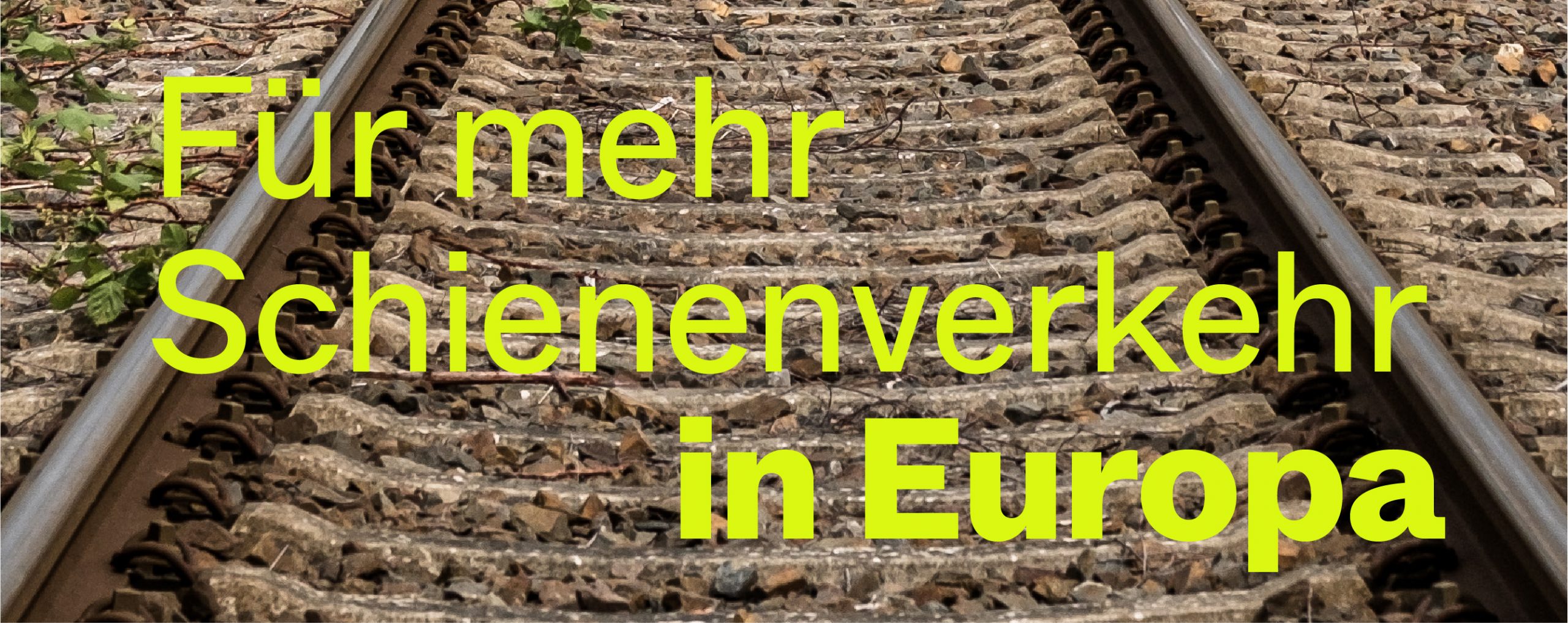
Headlines
Headlines are always set in the heavy font cut, left aligned and, in English, with mixed spelling, i.e Title Case.
If headlines get longer, they can be set in two weights to appear less heavy and have some contrast. When headlines with mixed weights are used, it’s always mixing VosslohRollingStock Whyte Regular (in the first line) and VosslohRollingStock Whyte Heavy (in the second line).
Headlines with two different weights can have three kinds of layout set ups:
Opt. 1: Standard
One where the full sentence is heavy not are.
Opt. 2: Mixed
Where the lower, heavy part of the headline is moved in, minding the grid, separating itself from the first headline part.
Opt. 3: Mixed
One where two short sentences are set right after each other, in one unit—that helps putting emphasis on the second part of the headline, like a highlight.
This is an example of the headline Opt. 2, combined with a subline, and body copy—showcasing the contrast in font sizes.
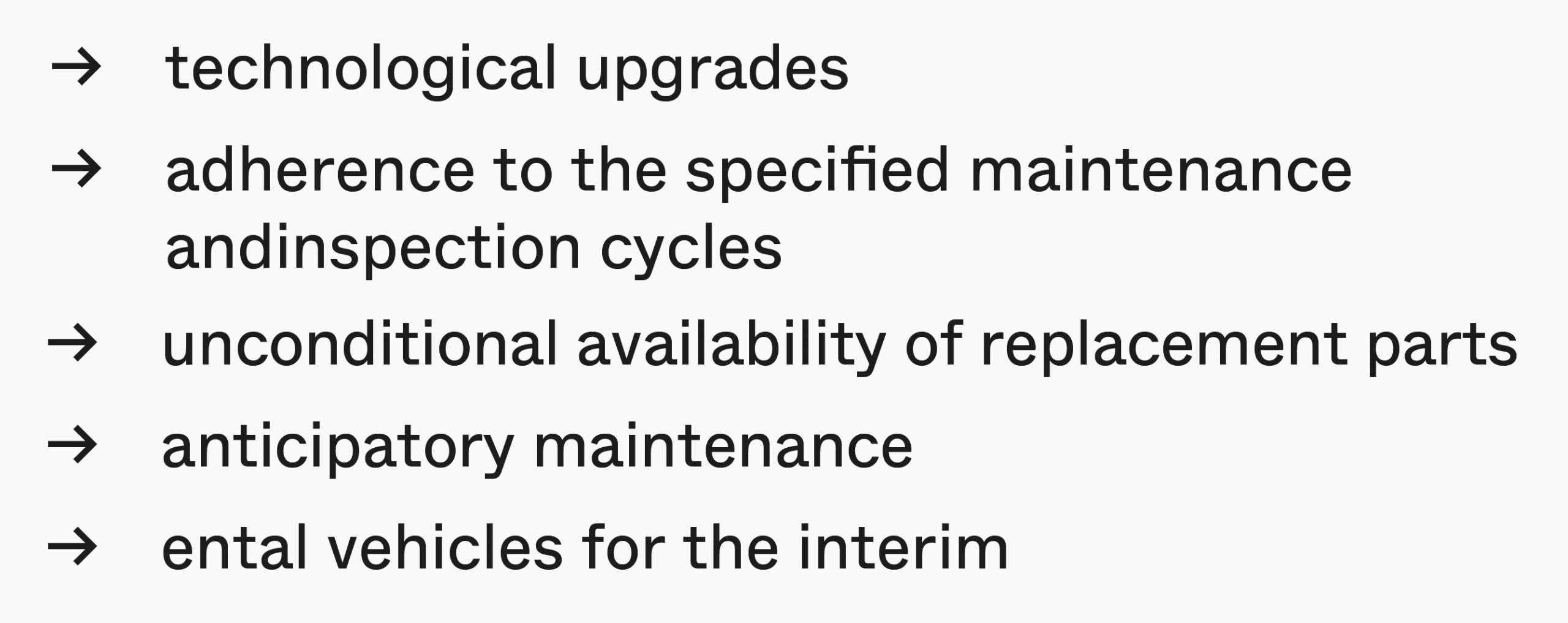
Bullets
Bullets are always made with a black arrow that can be found in the glyphs of the corporate font VosslohRollingStock Whyte. For the brochure template, the arrow bullets are already pre-set in the paragraph styles.